
This is the first post in an upcoming series about different techniques for visualizing which parts of an image a CNN is looking at in order to make a decision. Class Activation Mapping (CAM) is one technique for producing heat maps to highlight class-specific regions of images.
The Utility of Heat Maps
Here’s an example heat map:

In this image, from jacobgil/pytorch-grad-cam, a cat is highlighted in red for the class “Cat,” indicating that the network is looking at the right place when making the classification decision.
It’s useful to visualize where a neural network is looking because it helps us understand if the neural network is looking at appropriate parts of the image, or if the neural network is cheating. Here are some examples of how a neural network might cheat and look at the wrong place when making a classification decision:
- a CNN classifies an image as “train” when in reality it is looking for “train tracks” (meaning that it will incorrectly classify a picture of train tracks alone as “train”)
- a CNN classifies a chest x-ray image as “high probability of illness” based not on the actual appearance of disease but instead on a metallic “L” token placed on that patient’s left shoulder. The key is that this “L” token is only placed directly on the patient’s body if they are laying down, and the patient is only going to be laying down for the x-ray if they are too weak to stand. Thus the CNN has learned the correlation between “metallic L on shoulder” and “patient too sick to stand” — but we want the CNN to be looking for actual visual signs of disease, not metal tokens. (See Zech et al. 2018 “Confounding variables can degrade generalization performance of radiological deep learning models.”)
- a CNN learns to classify an image as a “horse” based on the presence of a lower left-hand corner source tag present in one-fifth of the horse images in the data set. If this “horse source tag” is placed on an image of a car, then the network classifiers the image as “horse.” (See Lapuschkin et al. 2019 Unmasking Clever Hans Predictors and Assessing What Machines Really Learn.”)
A Group of Related Papers
Here’s a diagram showing relationships between a few papers on CNN heat map visualizations. You can see CAM, the focus of this post, in the top left:
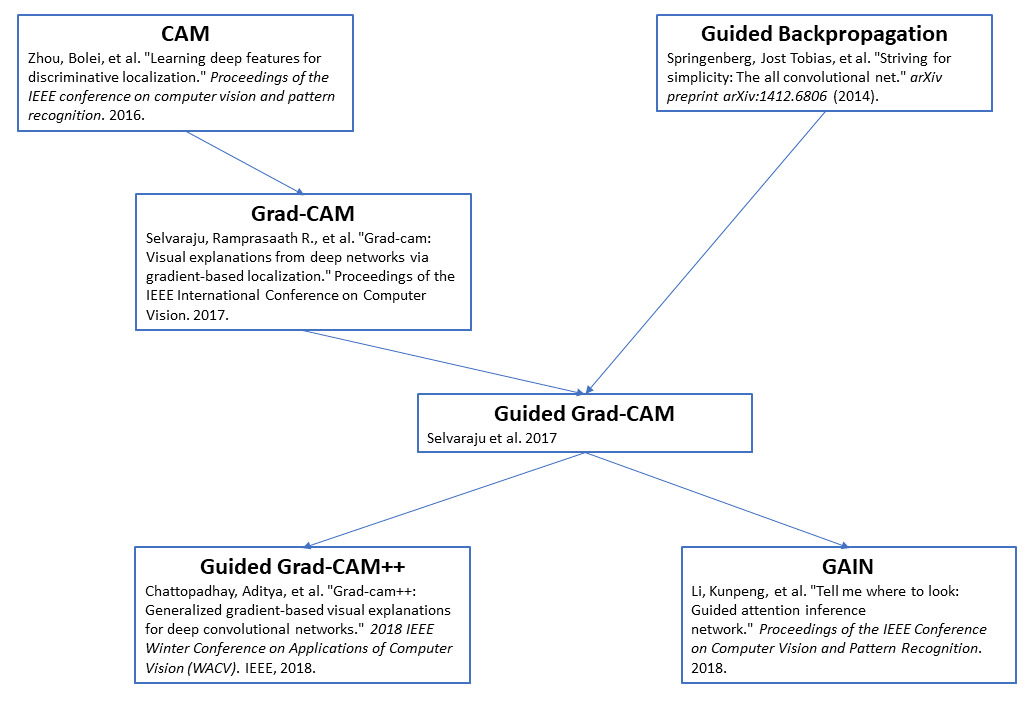
Here’s a link to the full CAM paper: Zhou et al. 2016 “Learning Deep Features for Discriminative Localization.” I especially recommend looking at Figures 1 and 2.
CAM: Class Activation Mapping
CAM Architecture
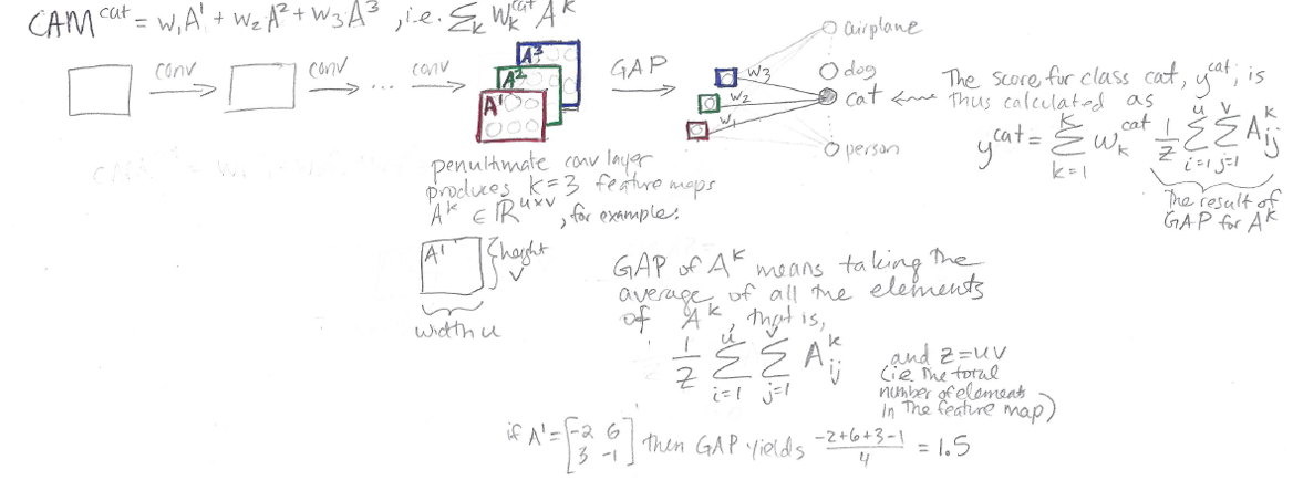
The idea behind CAM is to take advantage of a specific kind of convolutional neural network architecture to produce heat map visualizations. (See this post for a review of convolutional neural networks.)
The architecture is as follows: convolutional layers, then Global Average Pooling, then one fully-connected layer that outputs classification decisions.

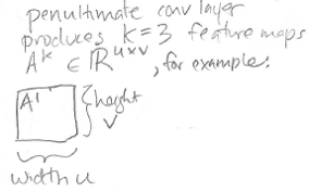
In the sketch above, we can see some generic convolutional layers, leading up a “penultimate convolutional layer” (i.e., the second-to-last layer in the network, and the last of the convolutional layers.) In this “penultimate conv layer” we have K feature maps. In this sketch, K = 3, for feature maps A1, A2, and A3.
But in reality K could be anything – you might have 64 feature maps, or 512 feature maps, for example.
Following the notation of this paper, each feature map has height v and width u:
Global Average Pooling (GAP)
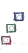
Global Average Pooling turns a feature map into a single number by taking the average of the numbers in that feature map. So, if we have K=3 feature maps, we’ll end up with K=3 numbers after Global Average Pooling. Those three numbers are represented as these three little squares in the diagram above:
Here’s the notation used here to describe GAP:
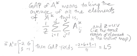
Thus, in GAP, we sum up the elements of the feature map Aij, from i = 1 to u (full width), and from j = 1 to v (full height), and then divide by the total number of elements in the feature map, Z = uv.
Fully Connected Layer and Classification Scores
After we perform Global Average Pooling, we have K numbers. We turn these K numbers into classification decisions using a single fully connected layer:
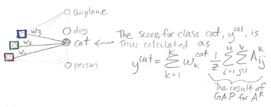
Note that in the diagram, I’m not showing every single weight in the fully connected layer, to avoid cluttering the drawing. In reality, the red number (output from GAP(A1)) is connected to each of the output classes by a weight, the green number (output from GAP(A2)) is connected to each of the output classes by a weight, and the blue number (output from GAP(A3)) is connected to each of the output classes by a weight. See this post for review of fully-connected layers.
Focusing on just the “cat” output class, we have three weights, w1, w2, and w3, which connect the outputs of our Global Average Pooling to the “cat” output node. We produce a score y^cat for class “cat” using the equation shown in the diagram above, which corresponds to
y^cat = (w1)(red) + (w2)(green) + (w3)(blue)
Class Activation Mapping
Now we’ve gone through the whole architecture, from input image to classification score. The last step is to obtain our CAM heat map visualization, which is done as follows:
![]()
This looks pretty similar to the way we calculated the score y^cat, but the difference is, instead of multiplying the weights w1, w2, and w3 by individual numbers produced by Global Average Pooling on feature maps Ak, we instead multiply the weights by the feature maps directly. Thus, while the output of the score is a single number, the output of CAM is actually a grid of numbers. This CAM grid of numbers is our heat map!
Summary
Here’s my one-page sketch summarizing the entire CAM paper:
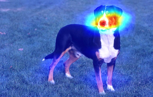
Featured Image: Greater Swiss mountain dog with CAM heat map from nickbiso/Keras-Class-Activation-Map
References
- Zhou et al. 2016 “Learning Deep Features for Discriminative Localization.”
- Selvaraju et al. 2017 “Grad-CAM: Why did you say that?”
- Global Average Pooling Layers for Object Localization
Want to be the first to hear about my articles bridging healthcare, artificial intelligence, and business—and get a free list of my favorite health AI resources? Sign up here.

Comments are closed.