
This post offers the clearest explanation on the web for how the popular metrics AUC (AUROC) and average precision can be used to understand how a classifier performs on balanced data, with the next post focusing on imbalanced data. This post includes numerous simulations and AUROC/average precision plots for classifiers with different properties. All code to replicate the plots and simulations is provided on GitHub.
First, here is a brief intro to AUROC and average precision:
AUROC: Area Under the Receiver Operating Characteristic
The AUROC indicates whether your model can correctly rank examples. The AUROC is the probability that a randomly selected positive example has a higher predicted probability of being positive than a randomly selected negative example. The AUROC is calculated as the area underneath a curve that measures the trade off between true positive rate (TPR) and false positive rate (FPR) at different decision thresholds d:

A random classifier (e.g. a coin toss) has an AUROC of 0.5, while a perfect classifier has an AUROC of 1.0. For more details about the AUROC, see this post.
Average Precision (aka AUPRC): Area Under the Precision-Recall Curve
Average precision indicates whether your model can correctly identify all the positive examples without accidentally marking too many negative examples as positive. Thus, average precision is high when your model can correctly handle positives. Average precision is calculated as the area under a curve that measures the trade off between precision and recall at different decision thresholds:

A random classifier (e.g. a coin toss) has an average precision equal to the percentage of positives in the class, e.g. 0.12 if there are 12% positive examples in the class. A perfect classifier has an average precision of 1.0. For more details about average precision, see this post.
Simulation Setup
In the simulations, I generate a ground truth vector indicating the true label for a series of examples (e.g. [0,0,1] for three examples that are [negative, negative, positive]) and a prediction vector indicating a hypothetical model’s predictions on that series of examples (e.g. [0.1,0.25,0.99]).
I generate the ground truth and predictions so that there are differing numbers of true positive, false positives, true negatives, and false negatives:
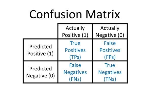
For a more detailed review of confusion matrices, see this post.
The simulated model results in this post were created relative to an assumed decision threshold of 0.5. For example, to create true positives from an assumed decision threshold of 0.5, I uniformly sampled prediction values between 0.5001 and 1.0, and marked the ground truth as 1 for each sampled value. Note that a decision threshold of 0.5 was used only for simulating the ground truth and prediction vectors. The AUROC and average precision are calculated with a sliding decision threshold, following their definitions.
All code to replicate the results and figures in this post can be found on GitHub.
Simulations for Balanced Data
Let’s look at plots of the AUROC and average precision on a balanced data set, i.e. a data set for which the number of actual positives and the number of actual negatives is equal.
Random Model
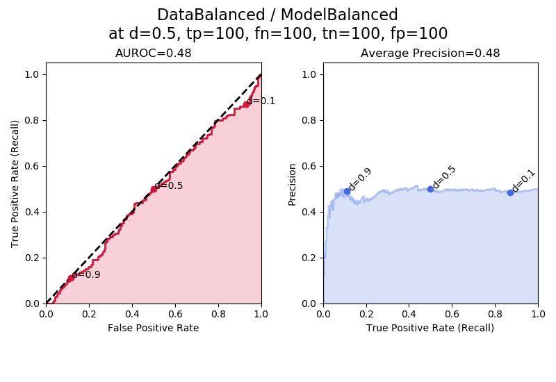
In the figure above for “ModelBalanced” the left plot (red) shows the receiver operating characteristic (ROC), with the title reporting the area under the ROC, or AUROC, in this case 0.48.
The right plot (blue) shows the precision-recall curve, with the title reporting the area under the precision recall curve (AUPRC) calculated using the average precision method.
Here, the AUROC is ~0.5, the baseline, and the average precision is also ~0.5, the baseline since the fraction of positives is 0.50. The values are not exactly 0.500 because of the random uniform sampling involved in the simulation. “ModelBalanced” means that the model isn’t skewed towards making positive or negative predictions, and also isn’t skewed towards making correct predictions. In other words, this is a random, useless model equivalent to a coin toss.
The line below the plot title reports the number of true positives (tp), false negatives (fn), true negatives (tn), and false positives (fp) at a decision threshold of 0.5 (d=0.5): “at d=0.5, tp=100, fn = 100, tn = 100, fp = 100.” This point is also plotted on the curve as the dot labeled “d = 0.5” for “decision threshold = 0.5.”
Additionally, I show the points on the curves where the decision threshold is equal to 0.9, 0.5, and 0.1. These points are labeled d = 0.9, d = 0.5, and d = 0.1. We can see that the decision threshold goes from 1 to 0 as we sweep from left to right. The curves themselves are relatively smooth because they were created using numerous decision thresholds; only 3 decision thresholds are explicitly shown as dots to emphasize properties of the curves.
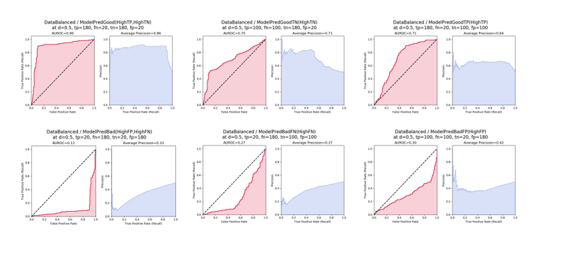
Bad Model Predictions
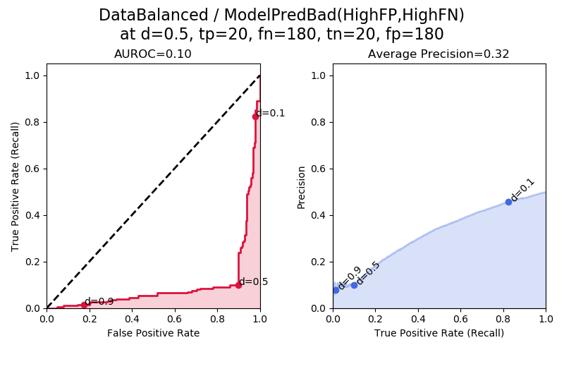
In “ModelPredBad” the model is skewed towards making bad predictions, i.e. it tends to get the wrong answer and has high false negatives and high false positives. Notice that here, the AUROC and average precision are both below the baseline. This illustrates an interesting fact about classifiers – in practice if you have a model that is “expertly bad” then you can just flip the classification decision and get a model that is good. If we flipped all of the classification decisions here, we could get a model with 1.0 – 0.11 = 0.89 AUROC. That is why the baseline for AUROC is always 0.5; if we have a classifier with AUROC below 0.5 we flip its decisions and get a better classifier with an AUROC between 0.5 and 1.0.
The “elbow” in the AUROC and average precision plots at d = 0.5 is due to the way the simulated results were created relative to a decision threshold of d = 0.5.
Good Model Predictions
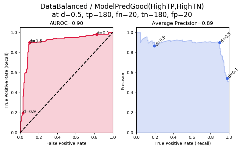
In “ModelPredGood” we have a good model that produces a lot of true positives and true negatives. We can see that the AUROC and average precision are both high.
Negative-Skewed Model Predictions
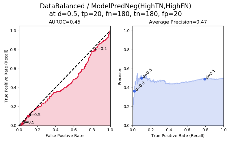
In “ModelPredNeg(HighTN,HighFN)” we have balanced data and a model that is biased towards predicting negatives. Although it predicts more negatives in total, it predicts the same number of true negatives as false negatives. Because tp == fp and tn == fn, the AUROC and average precision are once again around their baseline values of 0.5, meaning that this is a useless model.
We can confirm this by considering the formulas for TPR (true positive rate, recall), FPR (false positive rate), and precision. Since we have tp == fp, we can call this value a, i.e. tp == fp == a. Since we have tn == fn, we can call this value b, i.e. tn == fn == b. Then we can write:
For AUROC: TPR = tp/(tp+fn) = a/(a+b), and FPR = fp/(fp+tn) = a/(a+b). Thus, TPR and FPR are always equal to each other, meaning that the ROC is a straight line at y = x, meaning that the AUROC is 0.5.
For average precision: precision = tp/(tp+fp) = a/(a+a) = 1/2, and from before, TPR = recall = tp/(tp+fn) = a/(a+b). Thus, regardless of what the value of the recall is, the precision is always about 1/2, and so we get an area under the PR curve of 0.5.
Positive-Skewed Model Predictions
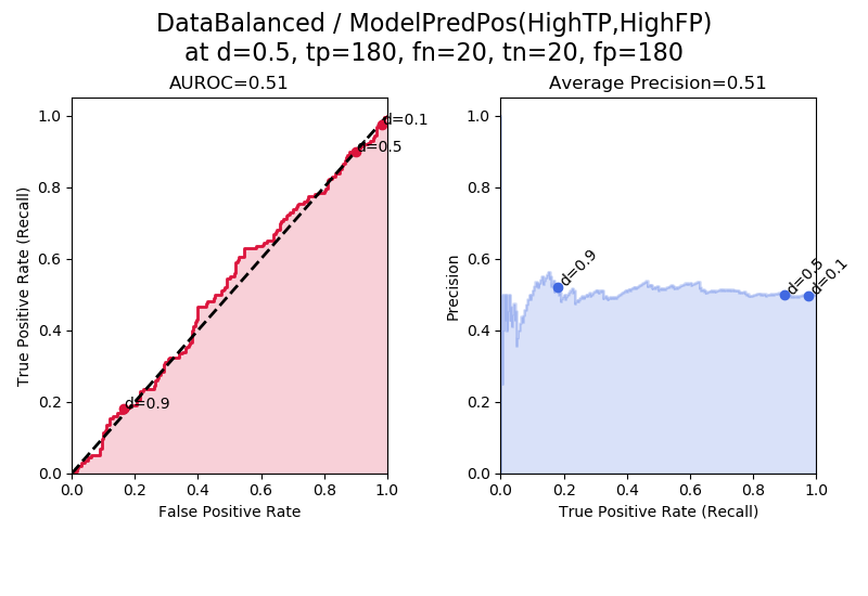
In “ModelPredPos(HighTP,HighFP)” we can see the same effect as we saw in “ModelPredNeg(HighTN,HighFN)”. This model is biased towards predicting positives, but although it predicts a larger number of positives in total, it predicts the same number of true positives as false positives, and so it is a useless model with AUROC and average precision at their baseline values.
It is also interesting to look at the points on the curves corresponding to d = 0.9, 0.5, and 0.1. Here, when the model tends to predict positives, the points for d=0.5 and d=0.1 are squished closer together. Immediately above, in “DataBalanced/ModelPredNeg” we instead have d=0.5 squished closer to d=0.9.
Good Model Predictions: High TNs
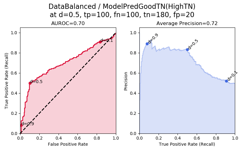
In “ModelPredGoodTN(HighTN)” the model is particularly good at identifying true negatives. This produces better-than-random AUROC and better-than-random average precision.
In the ROC plot (red), we see that the decision thresholds d = 0.9 to d = 0.5 span a small interval of FPR = fp/(fp+tn). This is because for these high decision thresholds, the fps are especially low and the tns are especially high, which produces a small FPR.
Note that the average precision is not explicitly improved by the number of true negatives, because true negatives aren’t used in the calculation of average precision. The average precision is improved by the decrease in false positives that occurs because some examples were shifted from being false positives to true negatives, which was required in order to keep the assumption that the dataset is balanced. Precision = tp/(tp+fp), so when we make the fp smaller, we increase the precision. Also, precision tends to be highest when the decision threshold is highest (the left side of the plot) because the higher the decision threshold, the more stringent the requirement for being marked positive, which in general increases tps and lowers fps.
Bad Model Predictions: High FPs
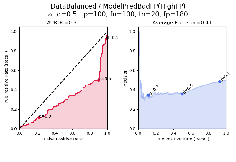
In “ModelPredBadFP(HighFP)” the model produces a lot of false positives. Once again because this model is “strategically bad” we could get a good model out of it by flipping its classification decisions. If we flipped its classification decisions, then the FPs would become TNs, and we would have a model biased towards predicting TNs — the exact model shown above in “ModelPredGoodTN(HighTN)”.
Good Model Predictions: High TPs
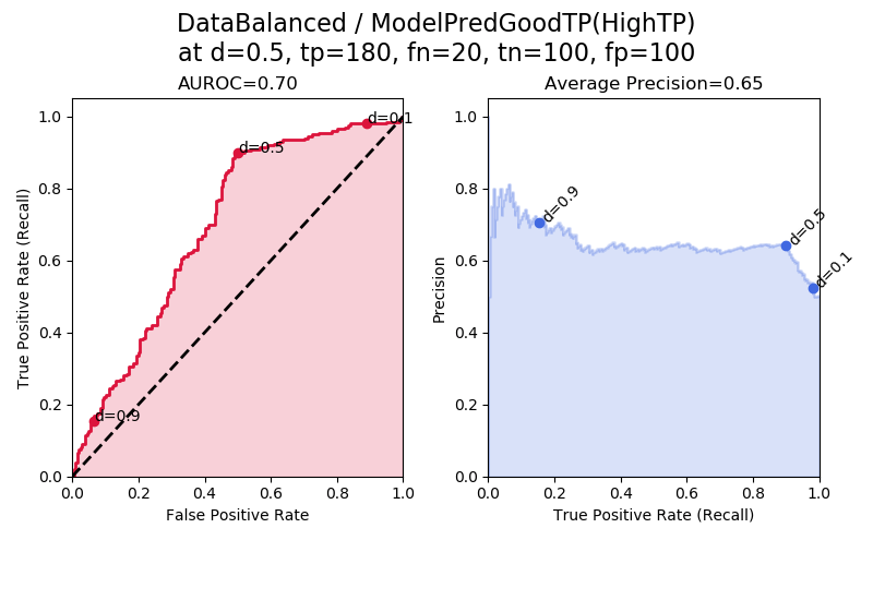
This is our second-to-last figure. In “ModelPredGoodTP(HighTP)” the model produces a lot of true positives. This leads to a better-than-random AUROC and a better-than-random average precision.
Notice how this ROC is peaked more towards the top, whereas in “ModelPredGoodTN(HighTN)” the ROC curve is peaked more towards the bottom. The ROC here is peaked more towards the top because a small range of TPR=tp/(tp+fn) is covered by the lower decision thresholds d = 0.5 to d = 0.1. That is because when the decision thresholds are low, in this tp-biased model we end up with a lot of tps and few fns, creating high recall across these various lower decision thresholds. The “elbow” being present at d = 0.5 is because of the way the synthetic results were generated relative to a decision threshold of 0.5.
Bad Model Predictions: High FNs

This is the final plot. “ModelPredBadFN(HighFN)” shows plots for a model that produces a particularly large number of false negatives. If we flipped this bad model’s classification decisions, all of the FNs would become TPs, and we would get the good model shown above as “ModelPredGoodTP(HighTP)”.
Summary
- ROC is a plot of TPR vs. FPR across different decision thresholds. AUROC is the area under the ROC. AUROC indicates the probability that a randomly selected positive example has a higher predicted probability of being positive than a randomly selected negative example.
- AUROC ranges from 0.5 (random model) to 1.0 (perfect model). Note that it is possible to calculate an AUROC less than 0.5 if the model is “expertly bad” but in these cases, we can flip the model’s decisions to get a good model with an AUROC greater than 0.5.
- A PR curve is a plot of precision vs. recall (TPR) across different decision thresholds. Average precision is one way of calculating the area under the PR curve. Average precision indicates whether your model can correctly identify all the positive examples without accidentally marking too many negative examples as positive.
- Average precision ranges from the frequency of positive examples (0.5 for balanced data) to 1.0 (perfect model).
- If the model makes “balanced” predictions that don’t tend towards being wrong or being right, then we have a random model with 0.5 AUROC and 0.5 average precision (for frequency of positives = 0.5). This is exemplified by “ModelBalanced”, “ModelPredNeg” (predicts many negatives, but equally TNs and FNs), “ModelPredPos” (predicts many positives, but equally TPs and FPs).
- If a model is “expertly bad” that means it tends to pick the wrong answer. “Expertly bad” models include “ModelPredBad(HighFP,HighFN)”, “ModelPredBadFN(HighFN)”, and “ModelPredBadFP(HighFP).” These models are so good at picking the wrong answer that they could be turned into useful models by flipping their decisions.
- “ModelPredGood(HighTP,HighTN)” gets the best performance, as it identifies a lot of TPs and TNs. “ModelPredGoodTN(HighTN)” and “ModelPredGoodTP(HighTP)” also get better-than-random performance because they tend to pick the right answer.
Want to be the first to hear about my articles bridging healthcare, artificial intelligence, and business—and get a free list of my favorite health AI resources? Sign up here.

Comments are closed.